Make your SharePoint intranet stand out with full-width sections
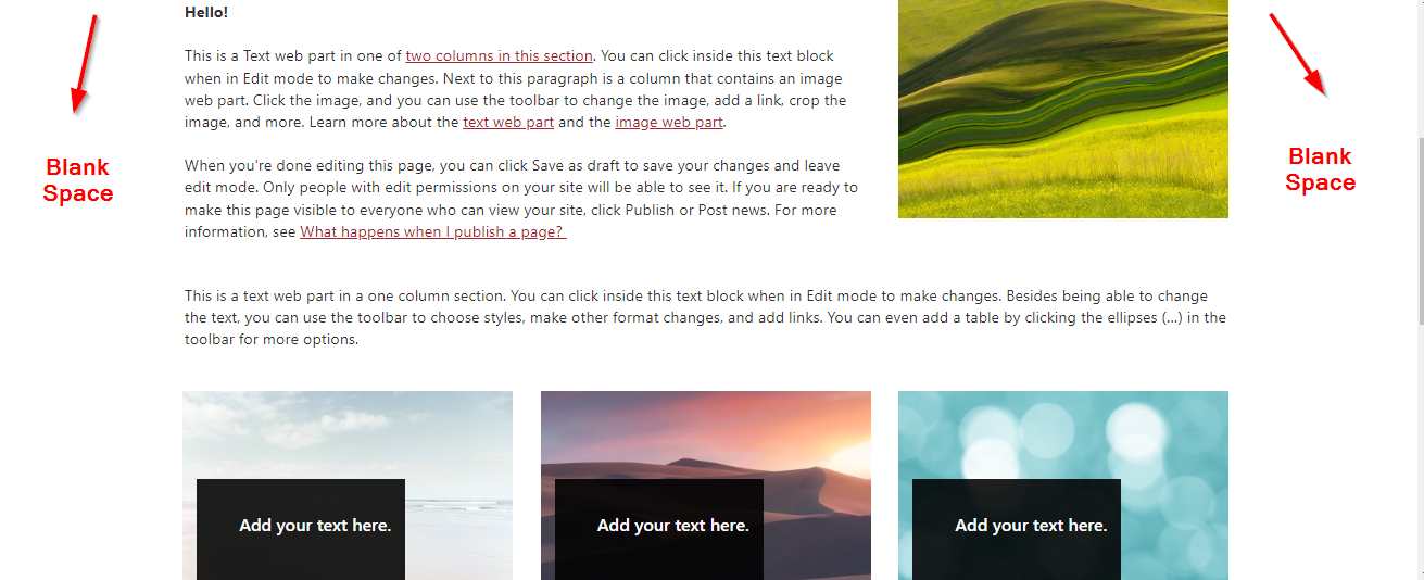
Modern SharePoint pages are super visual and intuitive to set up – all you need to do is click the edit button and choose from a huge range of layouts and available webparts. You may have noticed though that as you add webparts to your page, there is a lot of white, unused space on the sides of your page.
There is however a way to add a full-width section to your page:
1. Edit your page
2. On the left hand side click the + to add a new section and choose “Full width section”
3. Easy!
Just note however that you are limited in the types of webparts you can add to a full width section. The only ones you can add are:
Image
Hero
Countdown timer
Vertical sections – another way!
Just as with full-width sections, there is another way to maximise the real estate of the page – by using a “Vertical section”.
1. Edit your page
2. On the left hand side click the + to add a new section and choose “Vertical Section”
3. This will add a vertical section to the right hand side of the page. We are unable to define the length of the vertical section manually; it will grow or shrink depending on the content on the page.
So there you have it – two different ways to maximise the width of your modern SharePoint page.
Just note that it is not possible to use both a full-width column and a vertical section on a single page.


